SEDERA
SEDERA
SEDERA


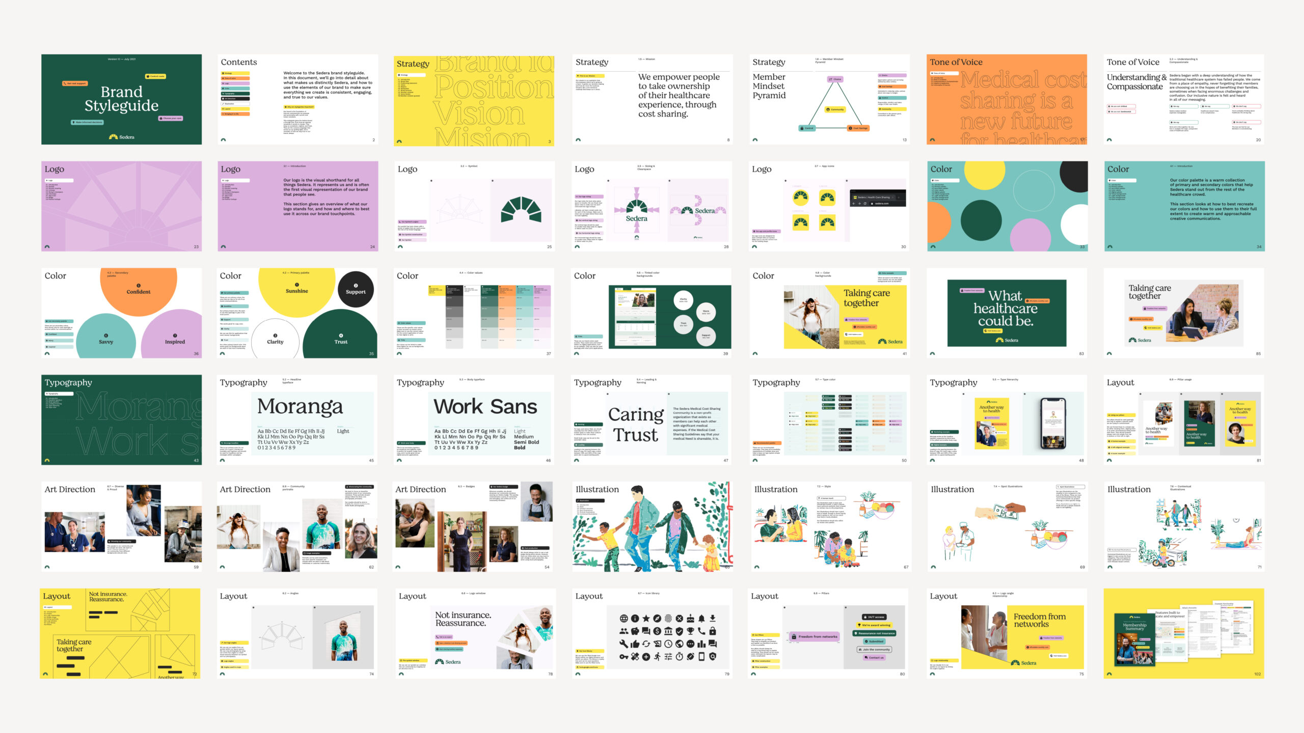
Sedera
+ Visual Identity
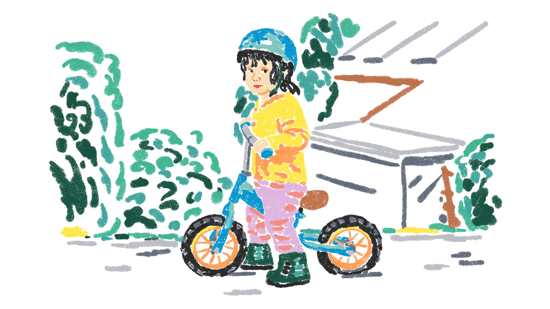
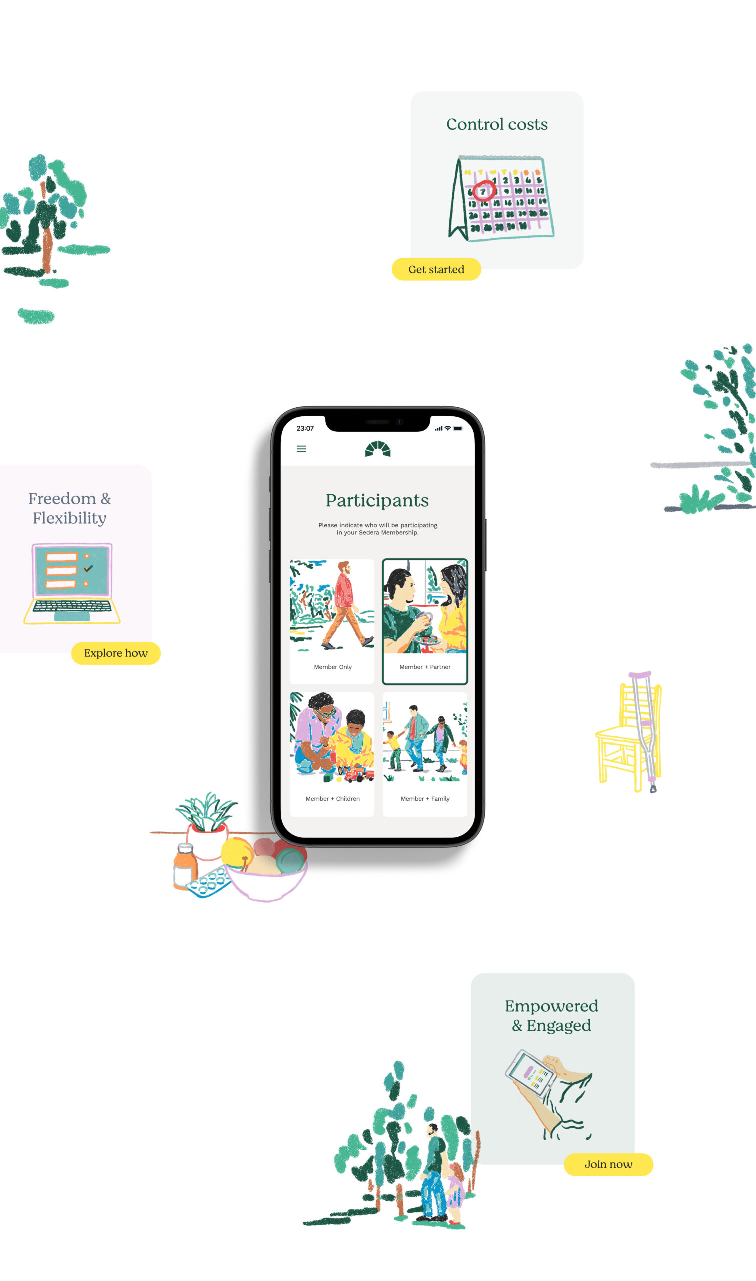
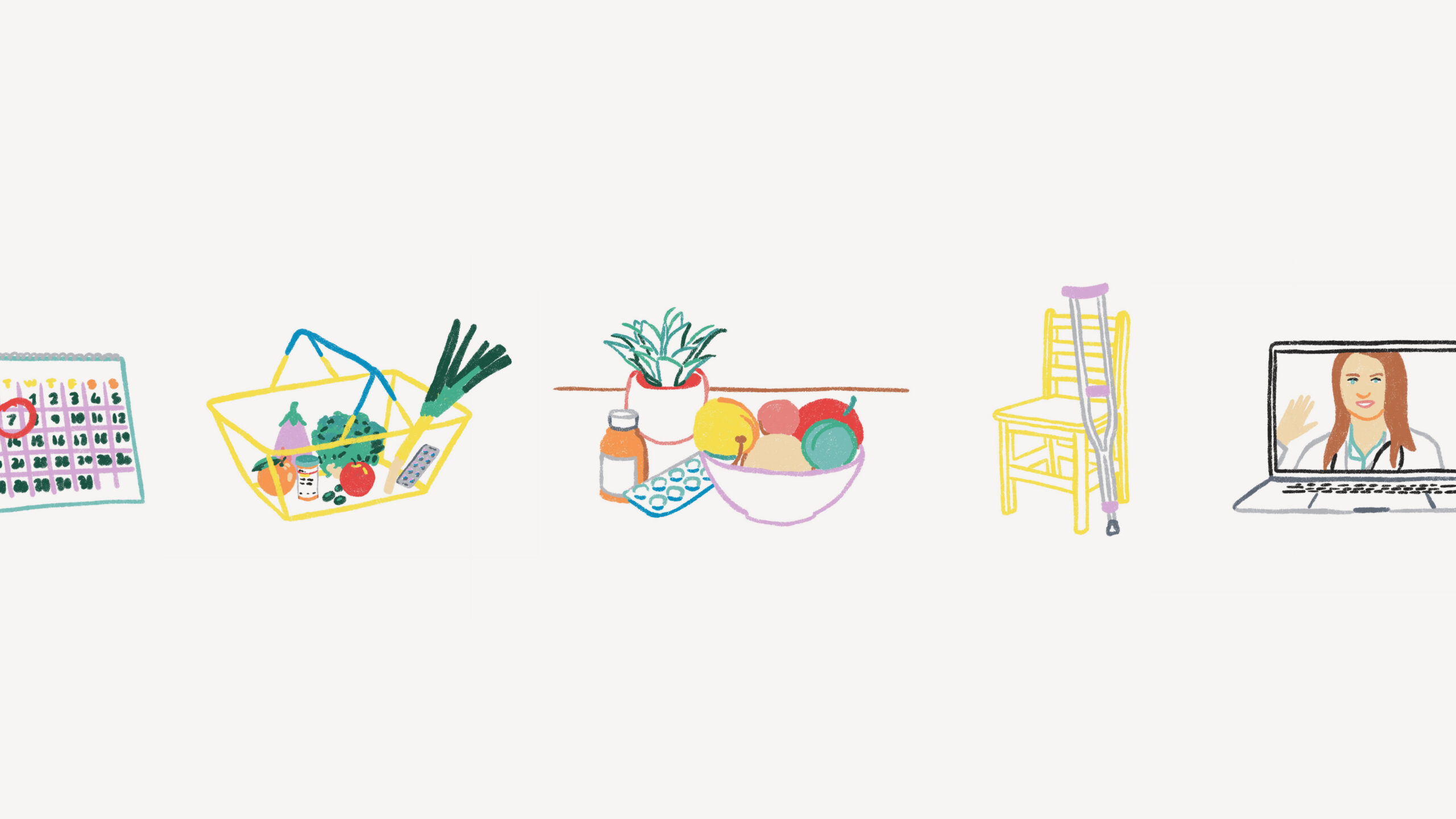
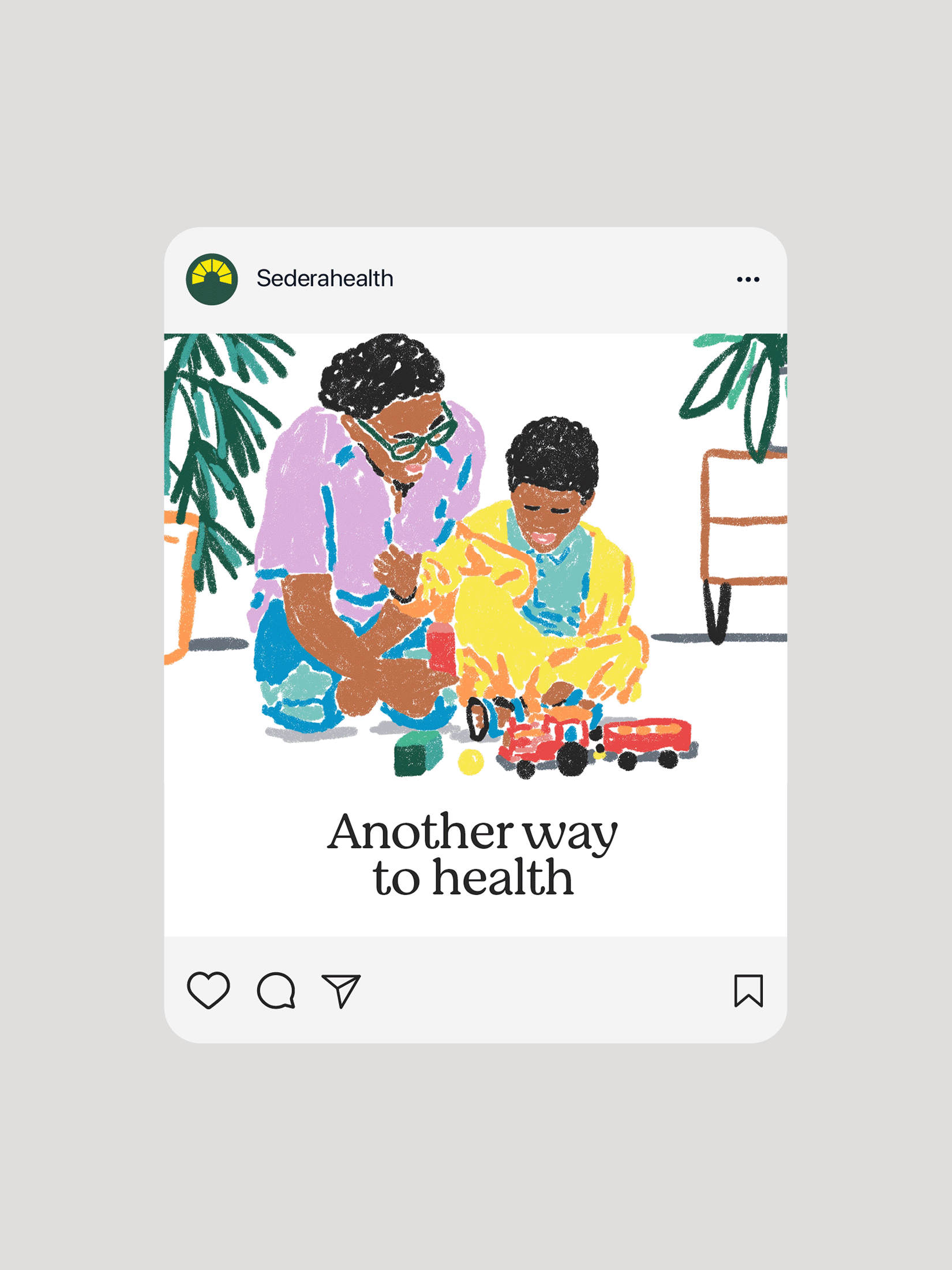
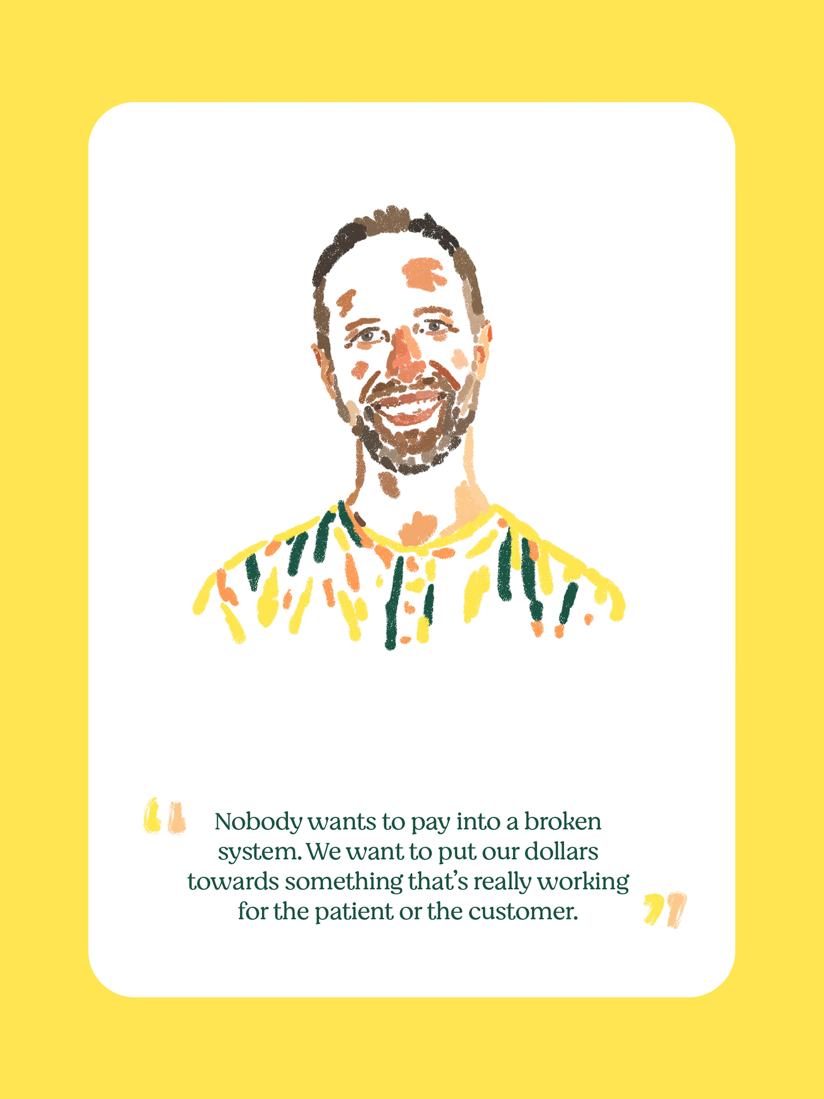
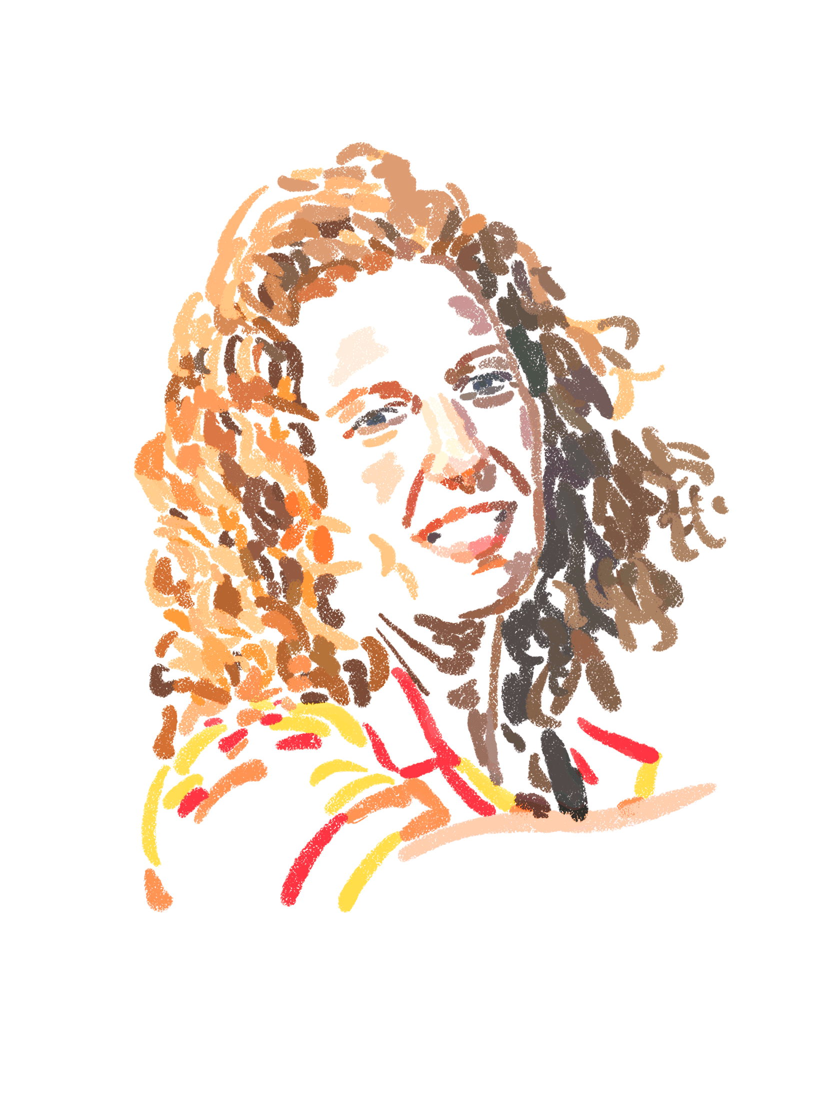
+ Illustration System
+ Digital Toolkit
+ Brand Guidelines
Studio: Koto
Role: Design Director
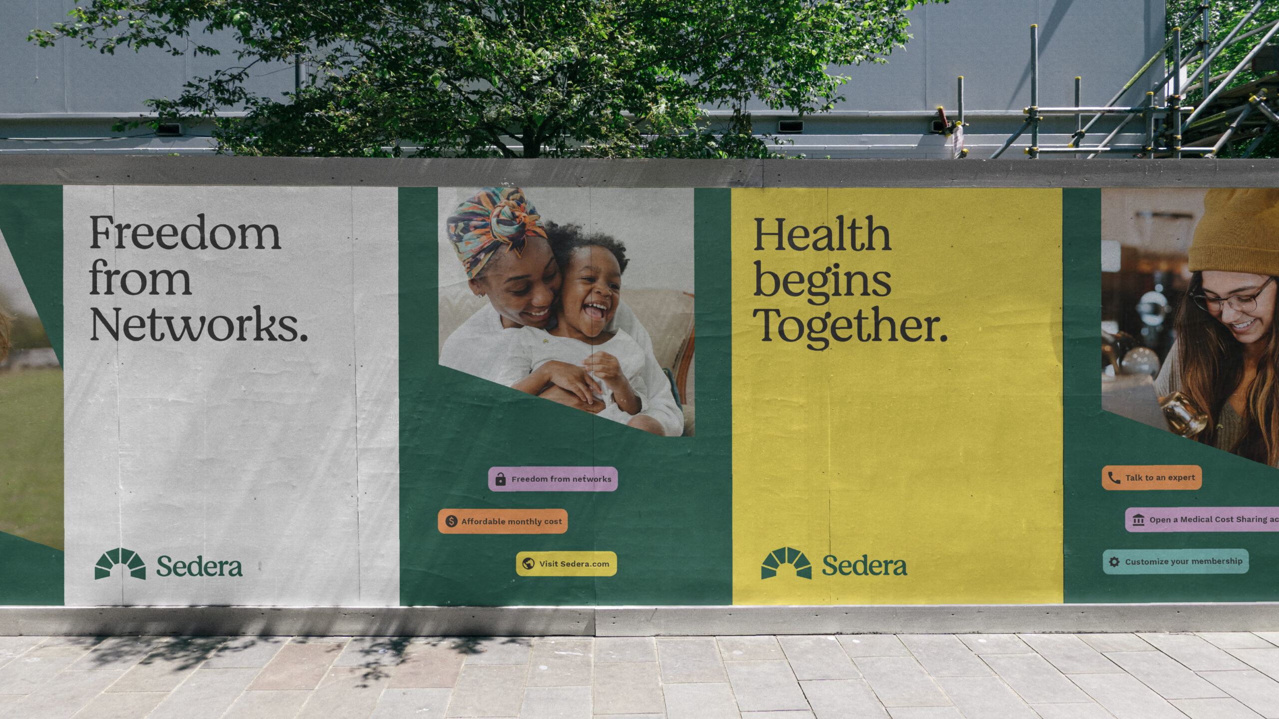
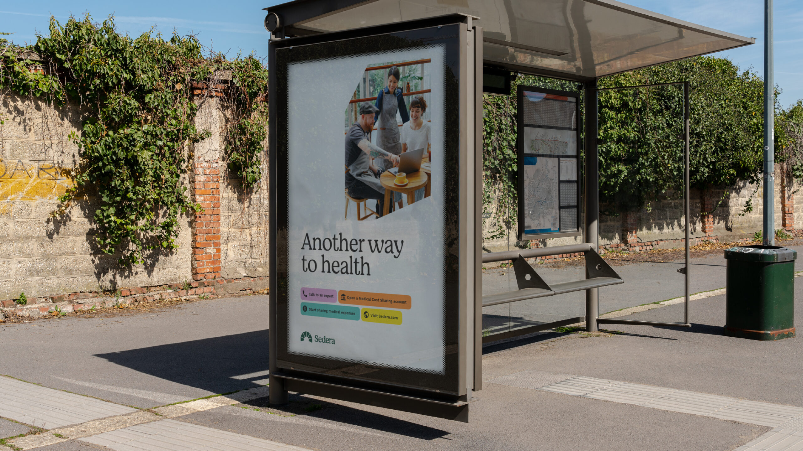
Not Insurance. Reassurance.
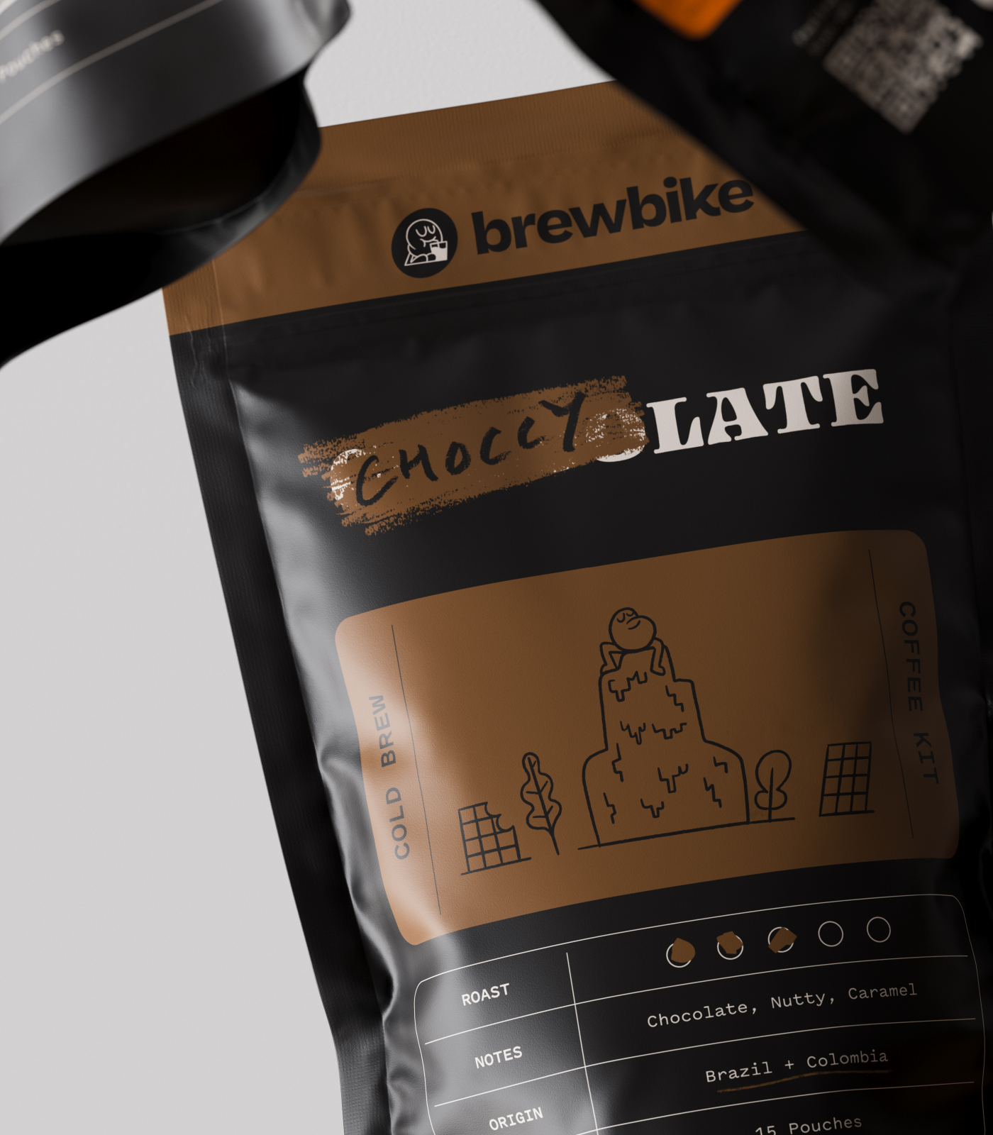
Sedera is, plain and simple, an alternative to traditional health insurance. It’s a medical cost sharing company where members share large, unexpected medical bills. When something happens – a surgery, accident, or emergency – the Sedera community funds kick in to help pay for what you need. It’s a new way for Americans to think about healthcare, so we approached this rebrand with clear intentions: to build a foundation of trust, heart, and community.
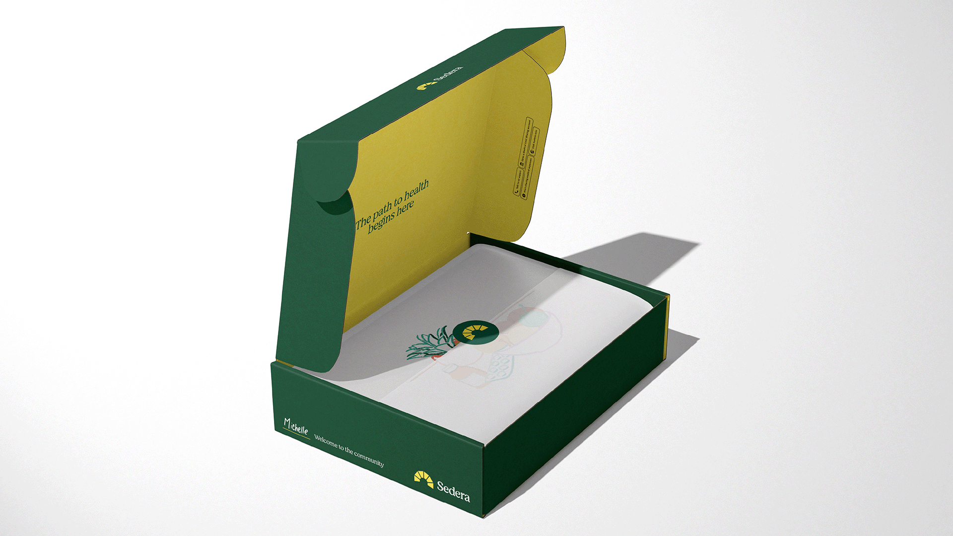
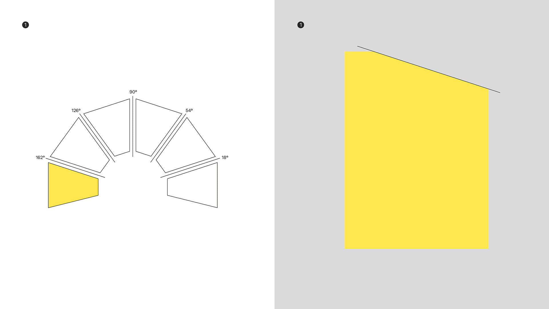
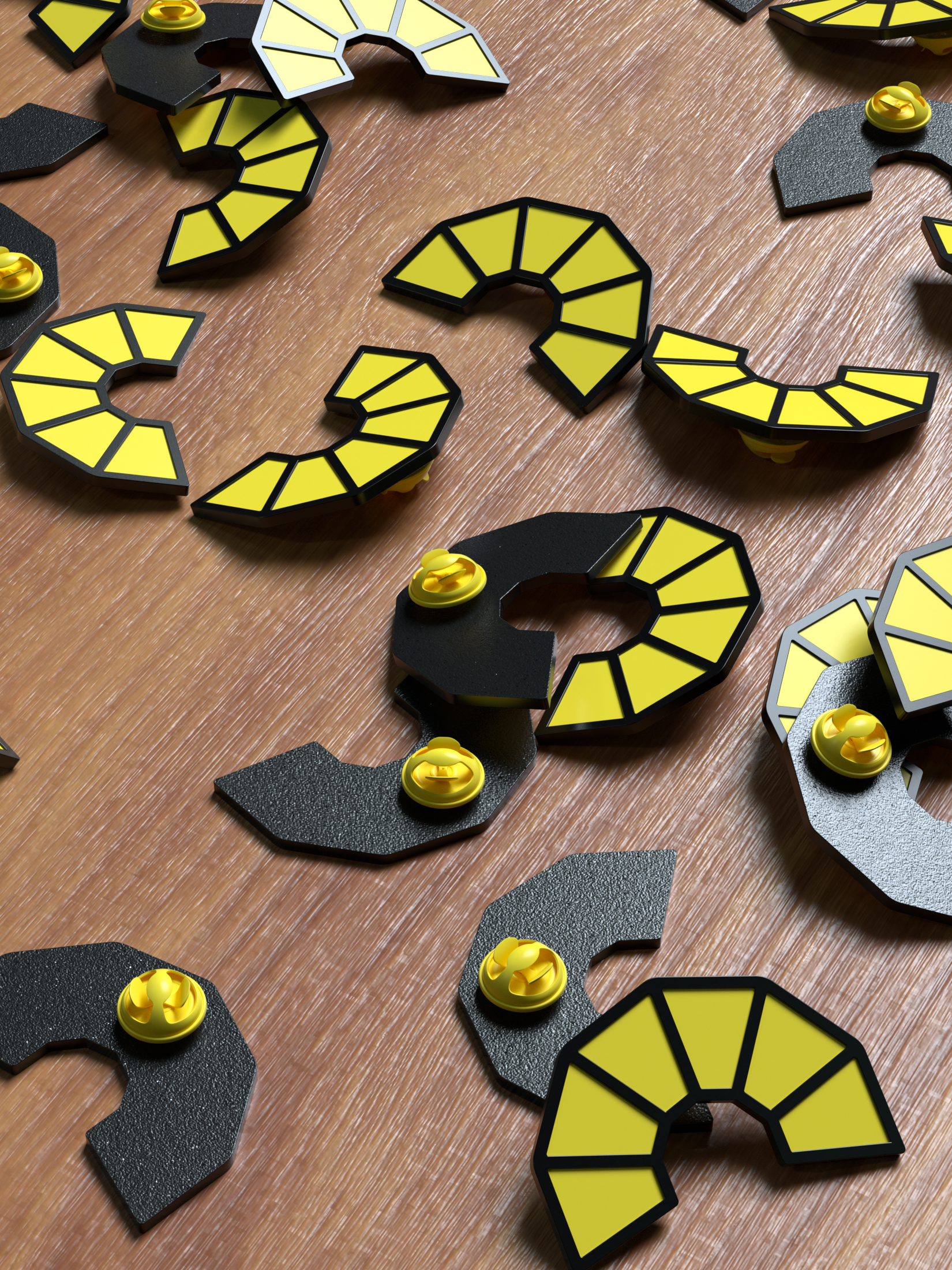
An open door
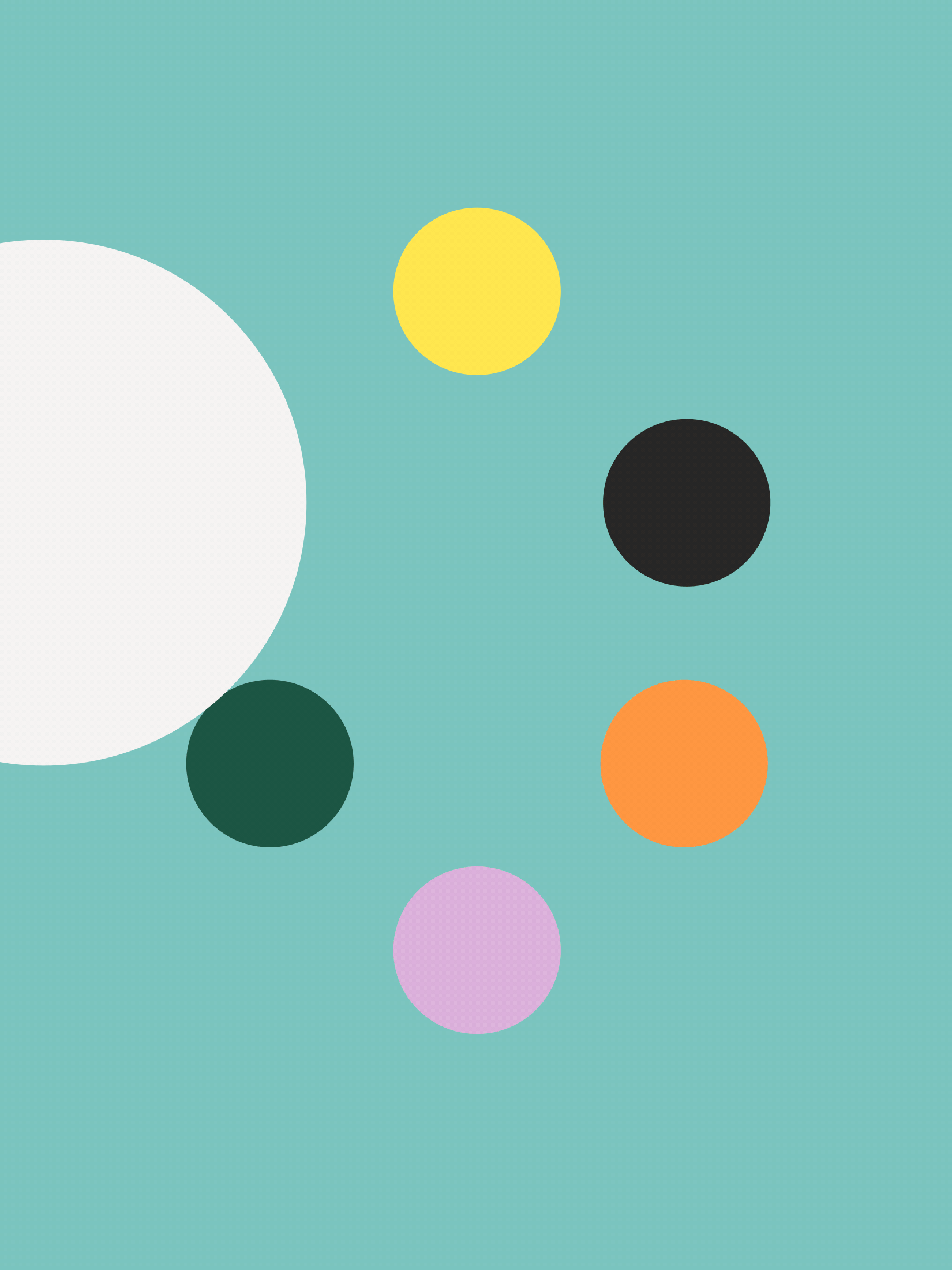
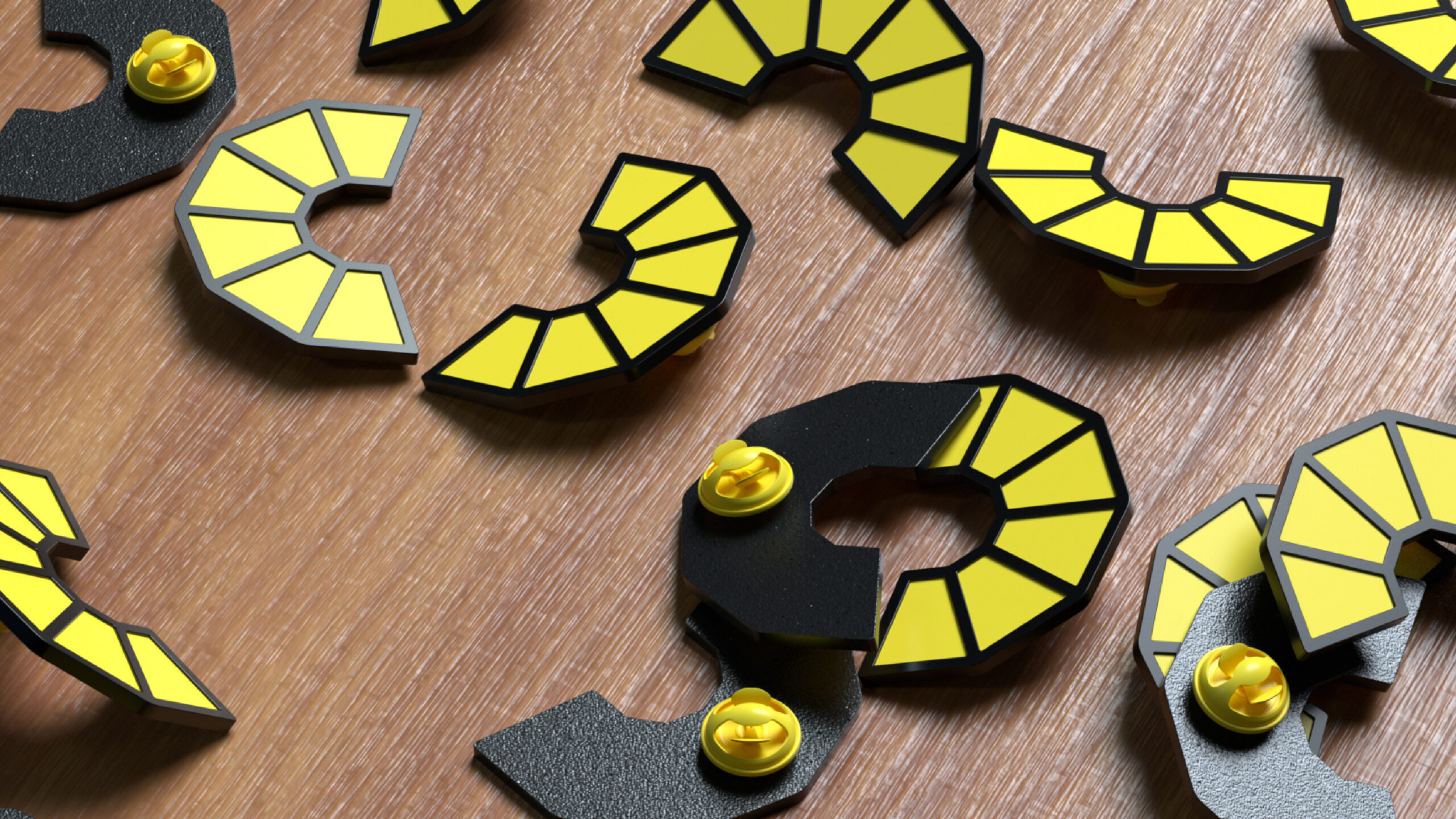
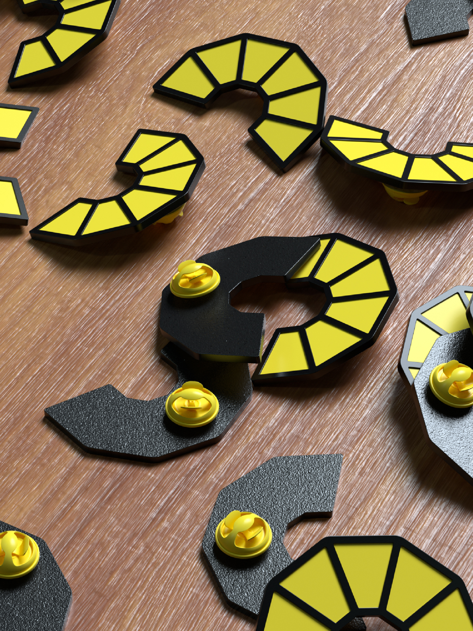
Our strategy’s core is reassurance, which inspired a symbol representing a new dawn of consumer choice and a fresh approach to healthcare. The color palette and illustration library reflect Sedera’s values while highlighting educational moments for prospective members.
Big Thanks
Jamie, Erika, Cathy, Alefiya, Heather and all of the team at Sedera. Luis Mazon for the illustrations and ON for the digital build.
SEE MORE
PROJECTS
:)