NETFLIX
NETFLIX
NETFLIX
Netflix
+ Illustration
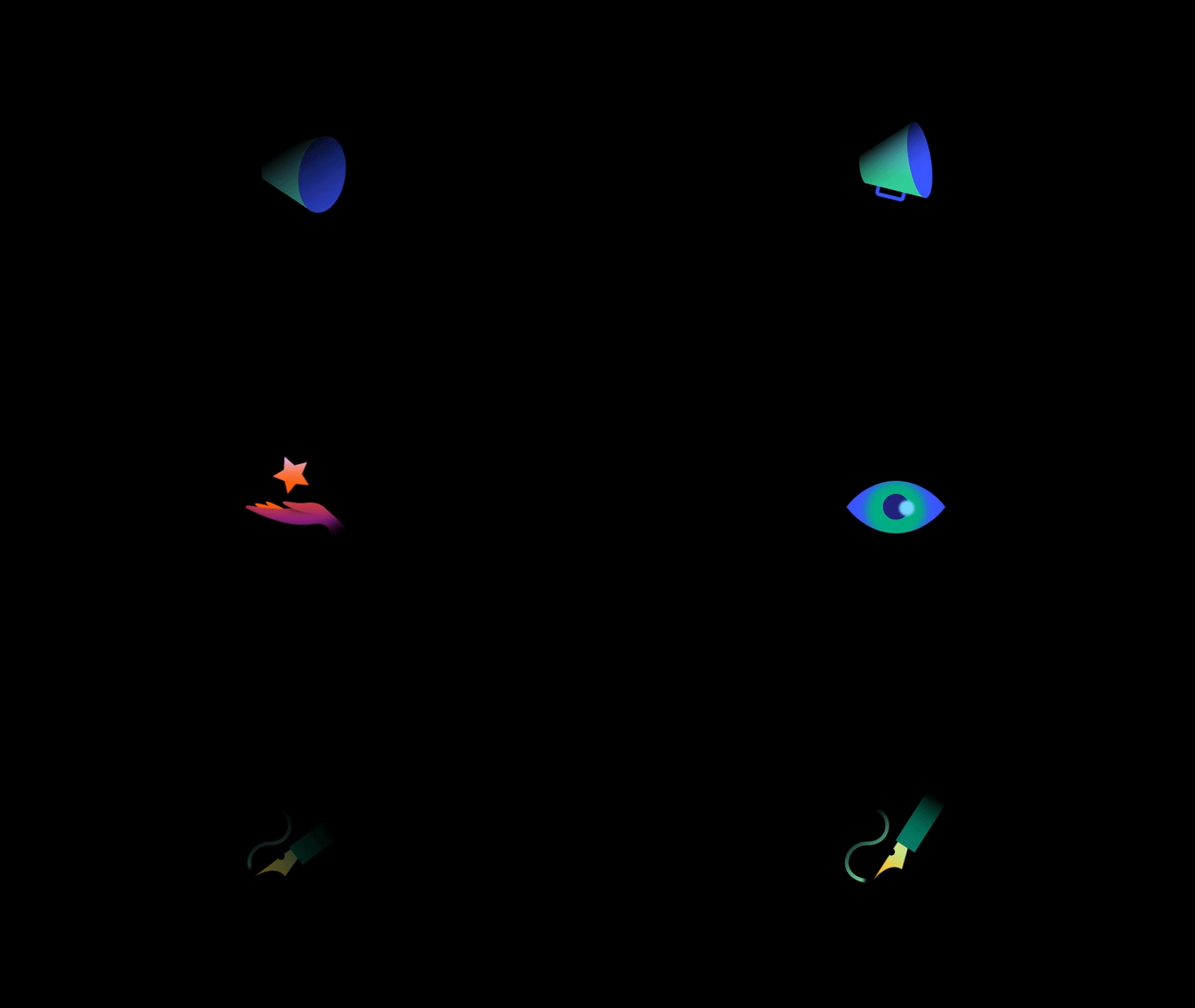
+ Iconography
+ Typography
+ Brand System
Studio: Koto
Role: Design Director
Tudummmm.
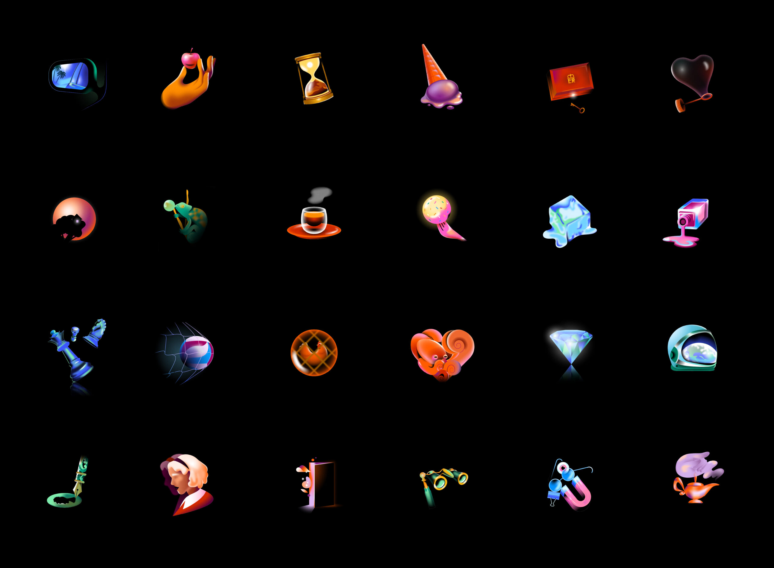
Cinema uses a language of its own. Netflix approached us to inject some of that language graphically across their product experience and beyond. Helping evolve their previous system by connecting iconography, typography, and illustration to roots within the cinematic universe, referencing effects and techniques reminiscent of the film-making process—in a way that feels immediately Netflix.
Steering clear of the over-saturated, over-done, one-dimensional approach to graphic language typical of the tech and streaming worlds, I helped define a style that speaks to film enthusiasts, and feels inherently Netflix while remaining true to their core values: pioneering, welcoming, and always stimulating.
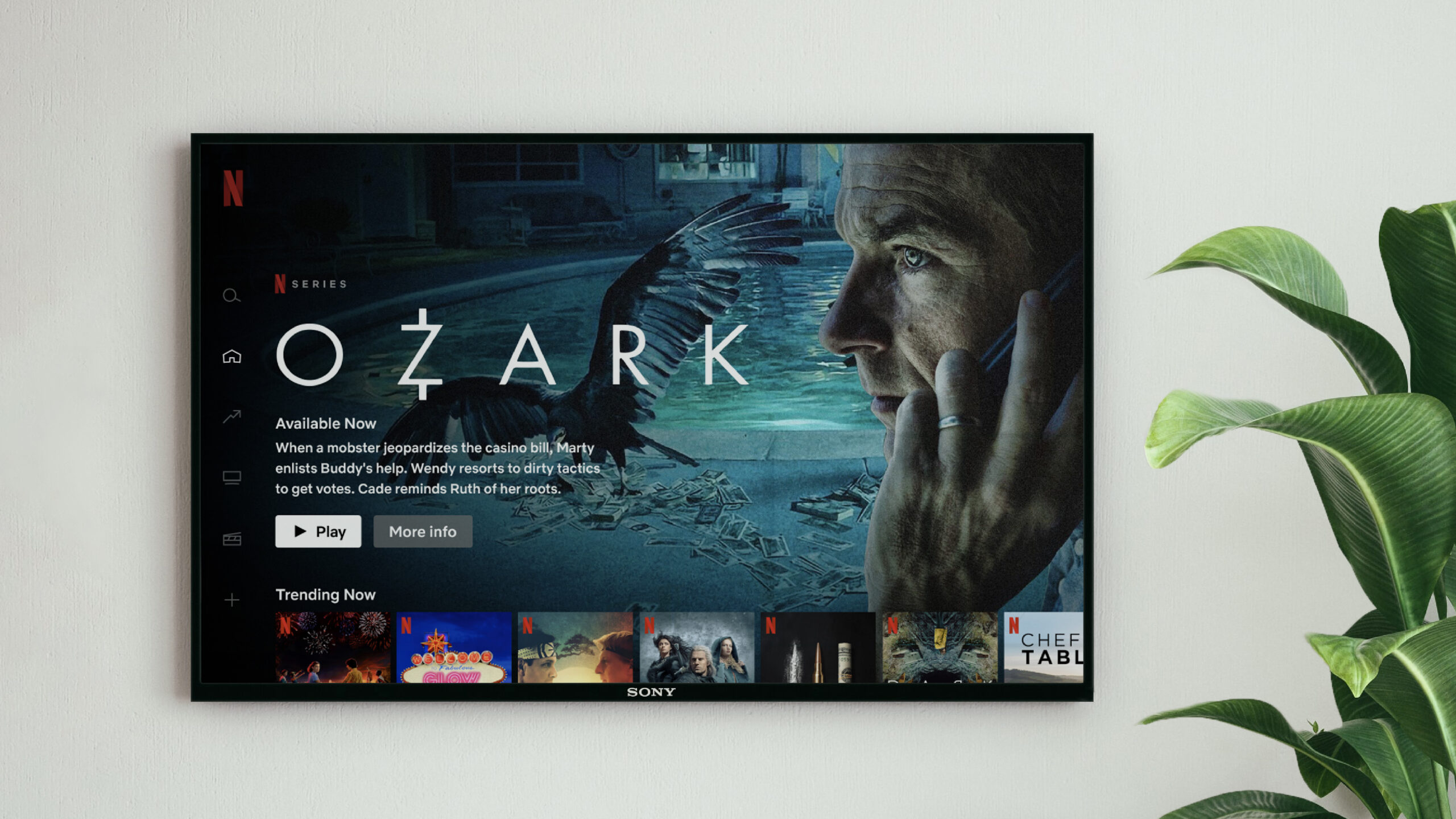
Given the range of viewing experiences available across Netflix, it was essential to maintain consistency with the new iconography across various screen sizes, ratios, and lock-ups. Additionally, the typography needed to remain legible in functional applications while also being flexible enough to adapt to bold cinematic title cards, genre-specific categories, or thematic comms.
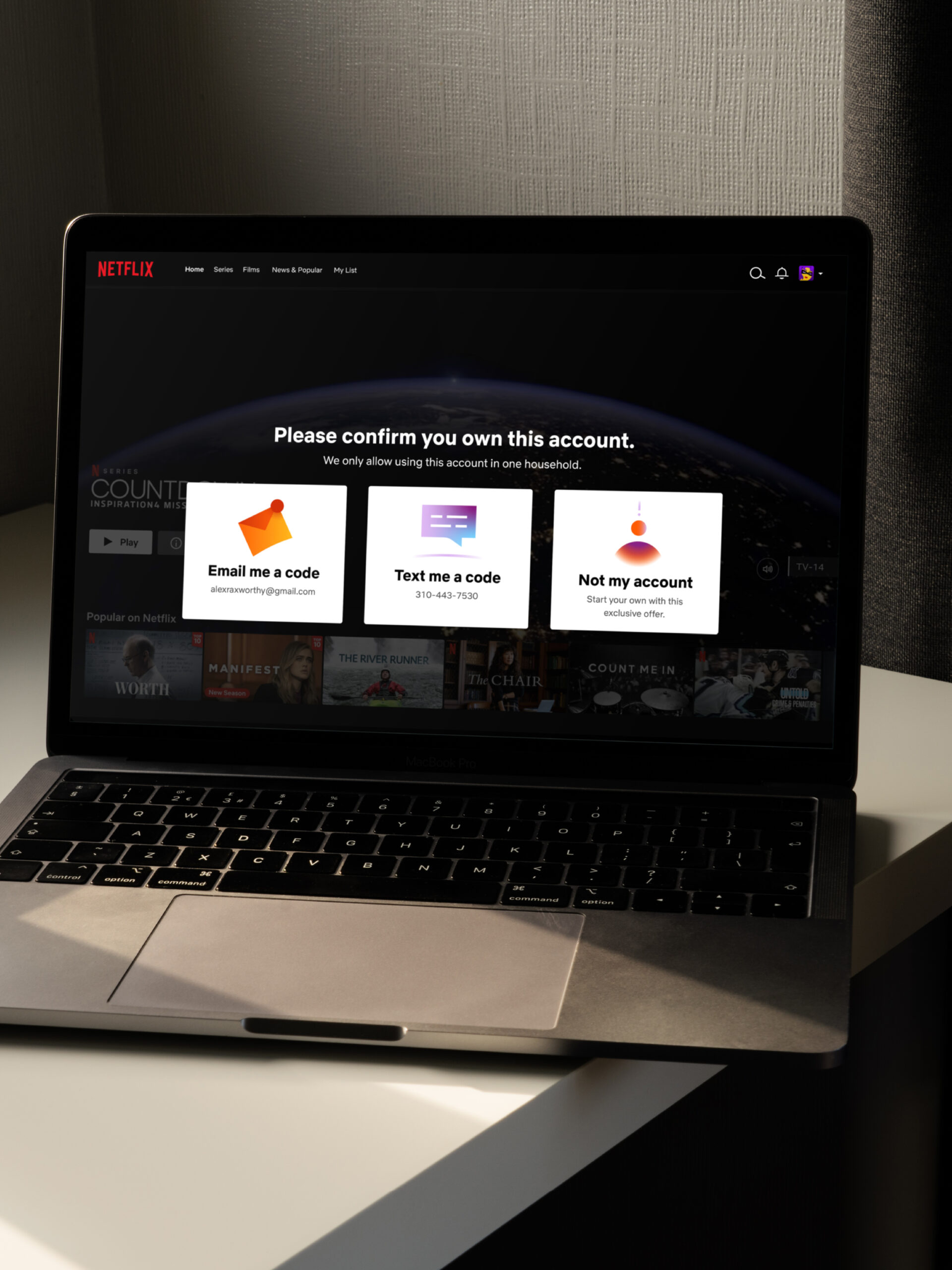
The new toolkit extends across typography and messaging, inviting users to engage with various prompts, instilled with moments of joy. The platforms unique visuals and spot illustrations are strategically placed throughout, guiding users whilst helping form a more cohesive, cinematic and solidified brand experience.
Thanks to the wonderful Netflix crew – Amber, Justine, Martin, Noah and the wider Netflix design team. Special thanks to collaborators Michael William Lester and Gica Tam for bringing their illustration and animation magic to the big screen.
SEE MORE
PROJECTS
:)
