AIRBNB PLUS
AIRBNB PLUS
AIRBNB PLUS
AIRBNB PLUS
AIRBNB PLUS


Airbnb Plus
+ Visual Identity
+ Brand System
+ Iconography
+ Brand Guidelines
Studio: Koto
Role: Design Director
A new tier of homes from Airbnb
Airbnb has spent the past decade working towards its vision of a world where anyone can belong anywhere. Over 300 million trips later and it launched Airbnb Plus: a new tier of homes that have been personally verified for quality and comfort. Not only does this broaden Airbnb’s appeal to even more guests, but it also allows the business to recognize those hosts who go above and beyond in their outstanding hospitality.
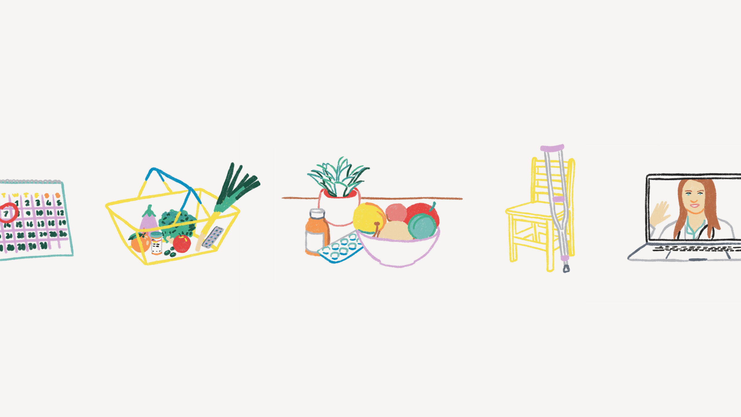
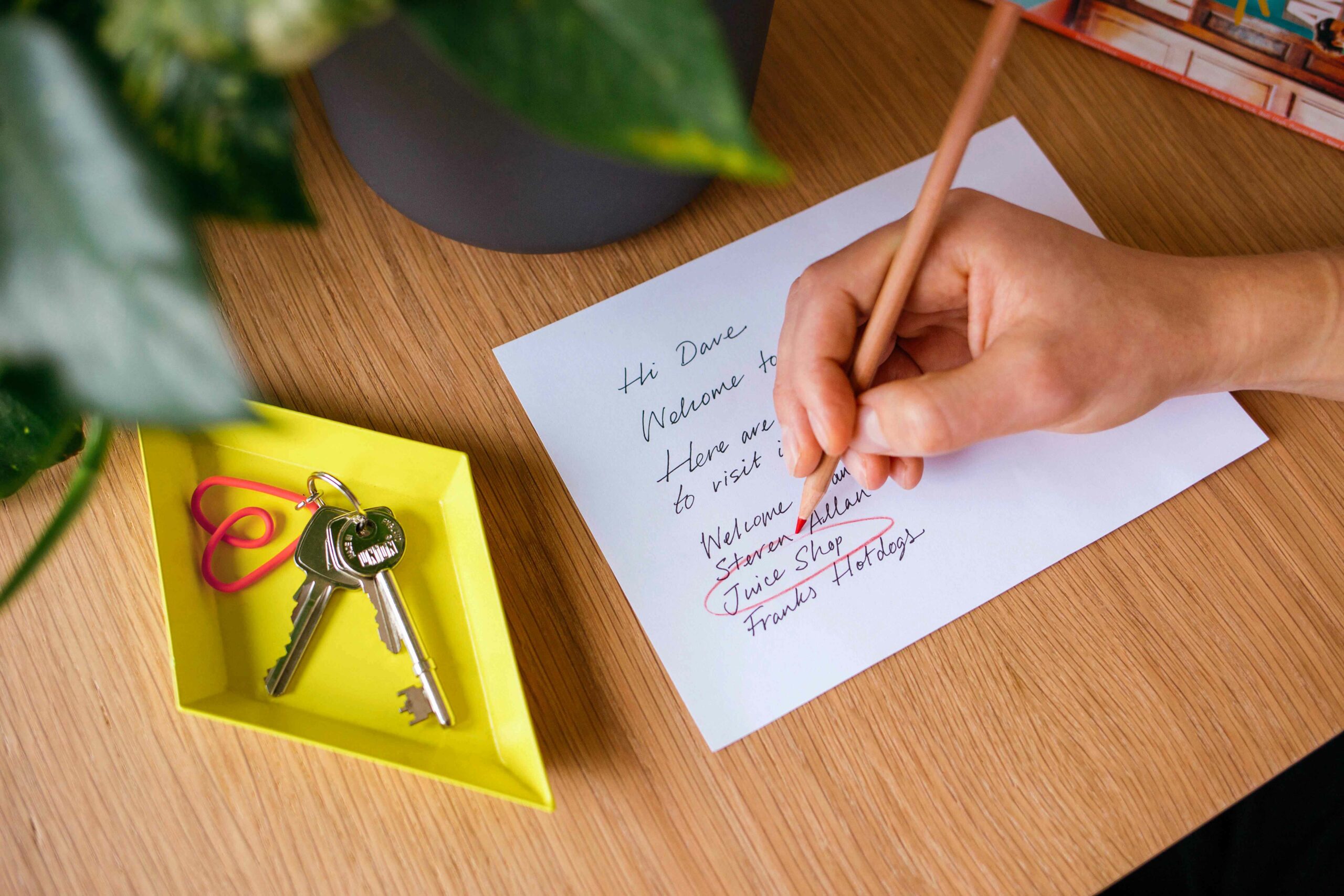
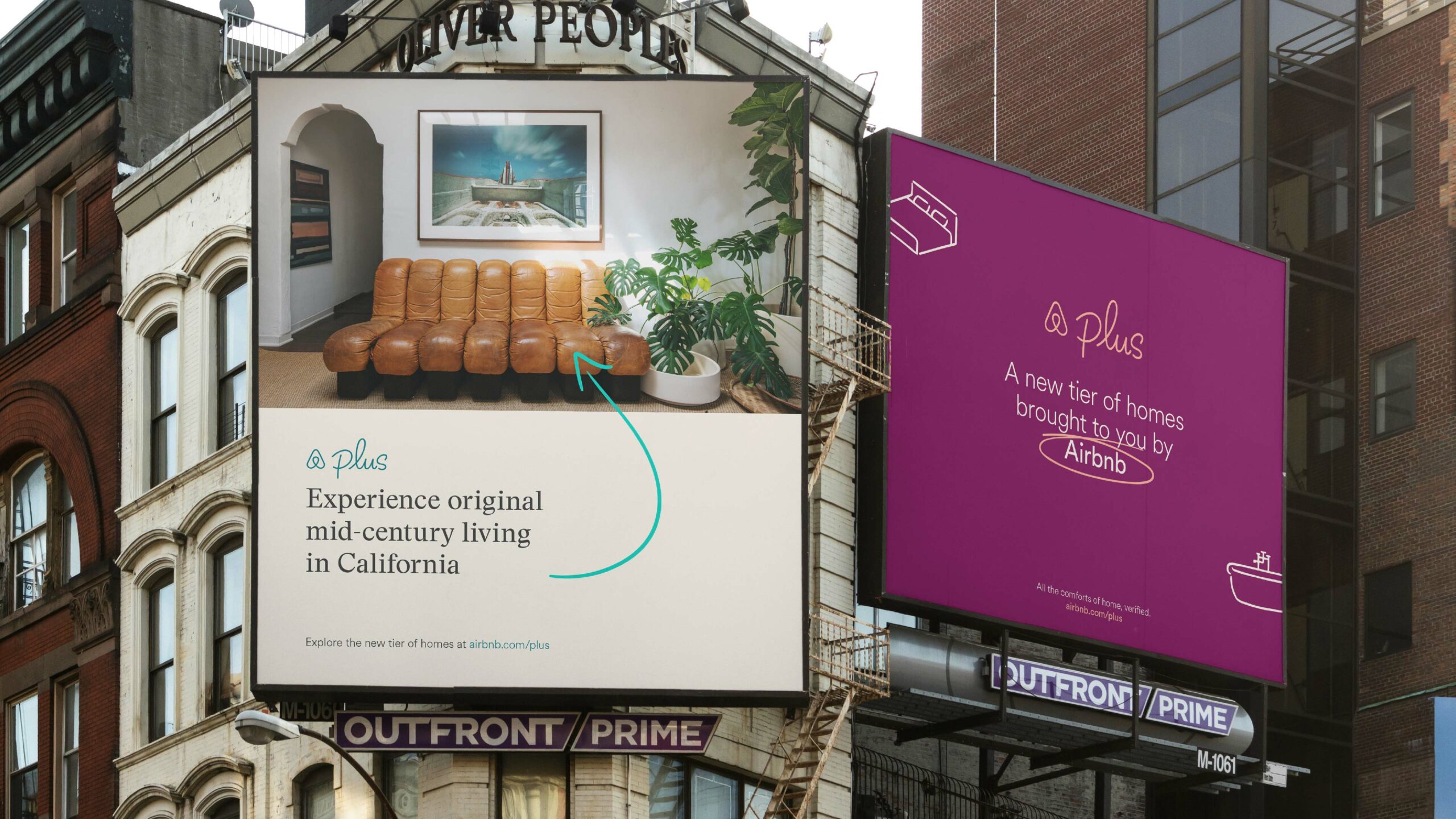
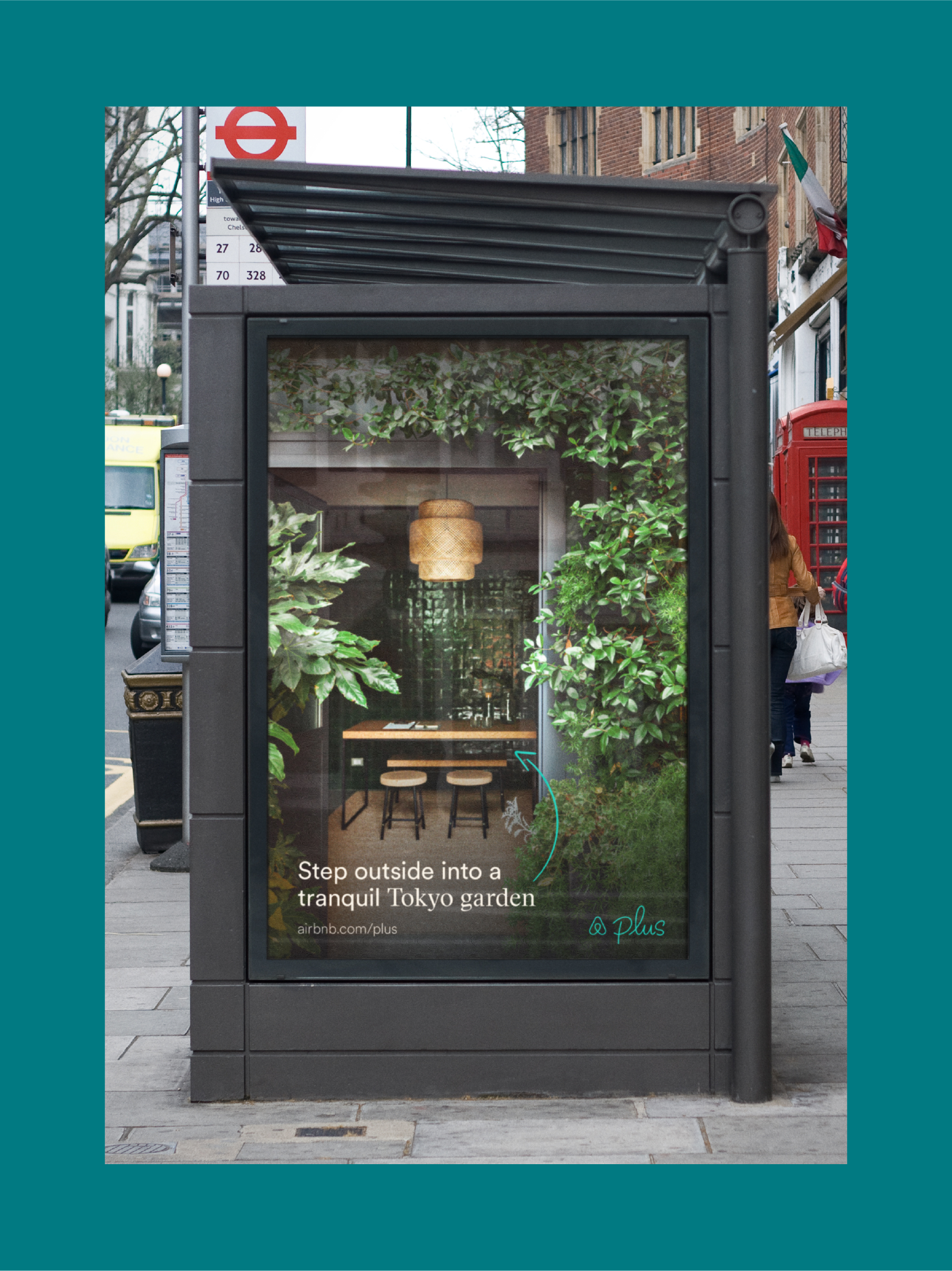
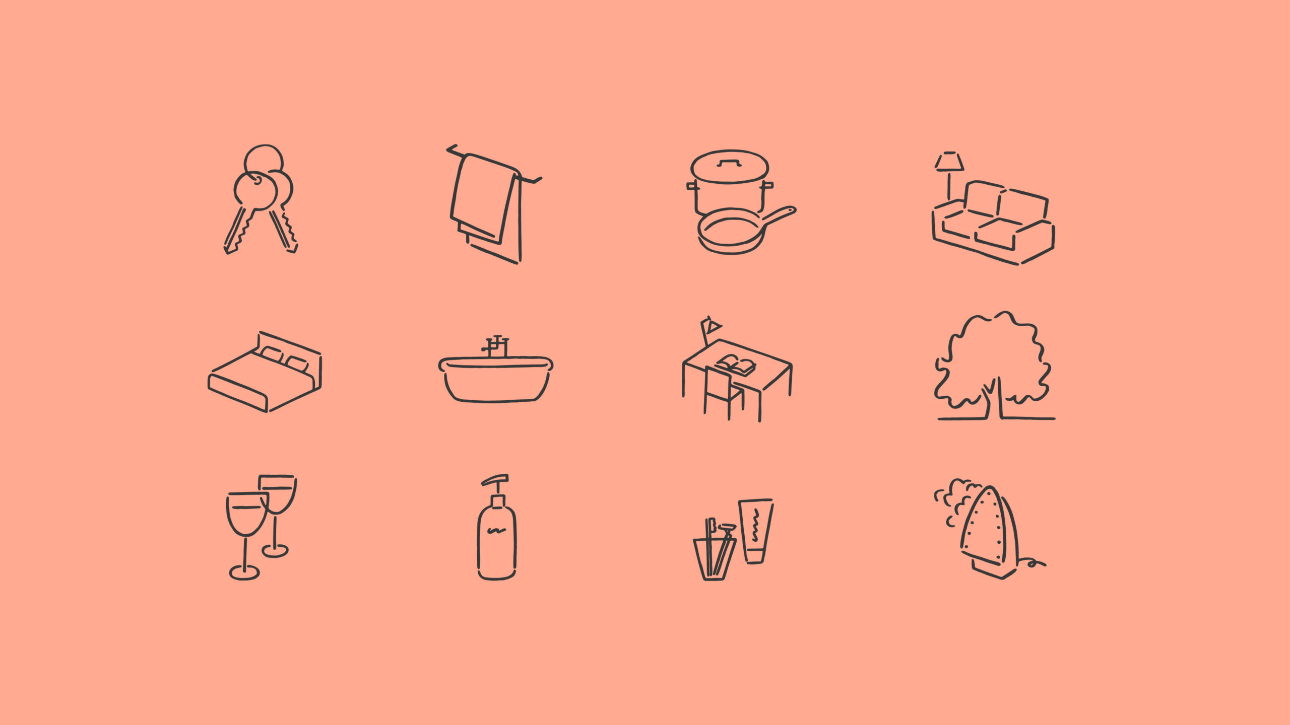
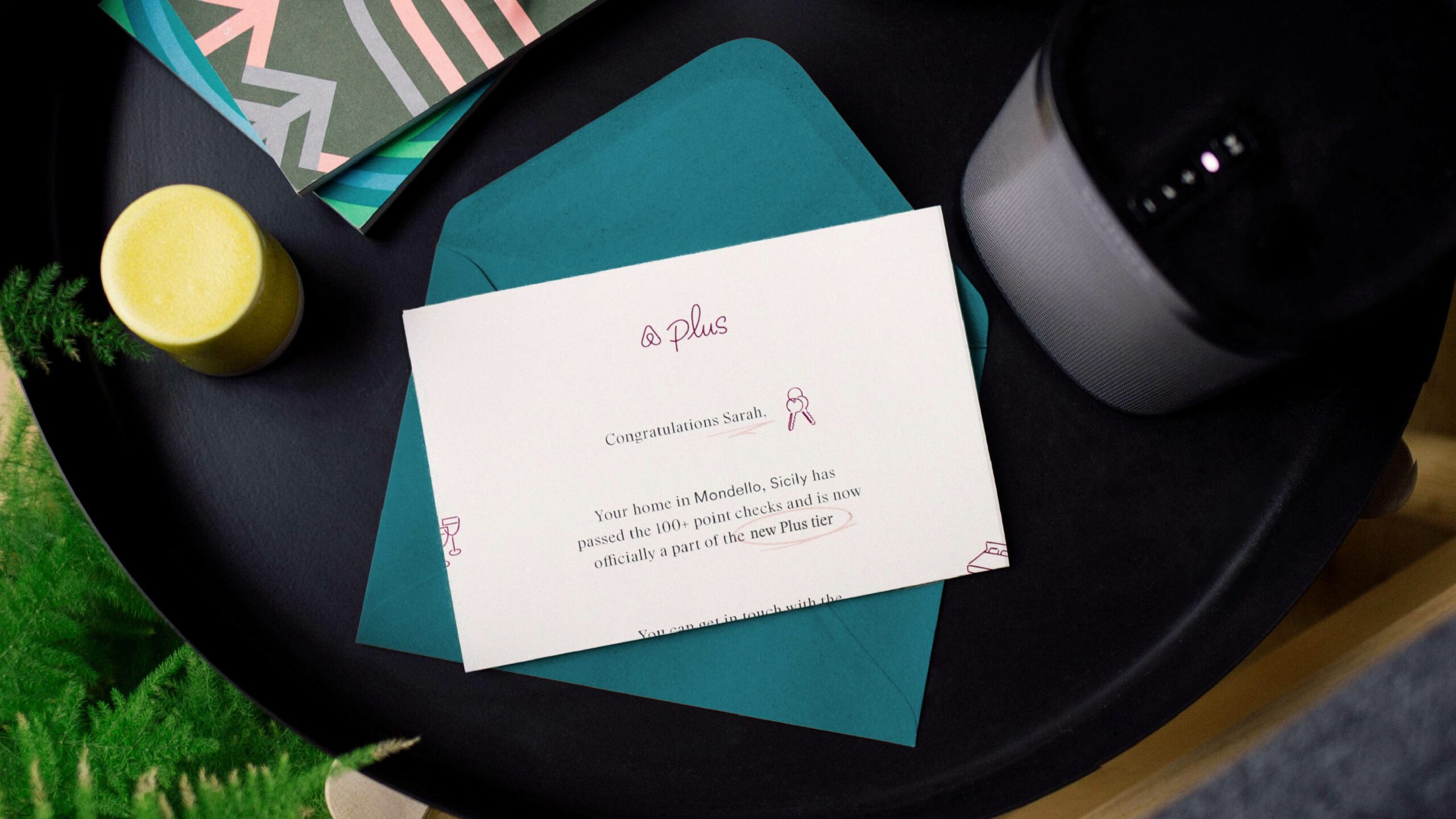
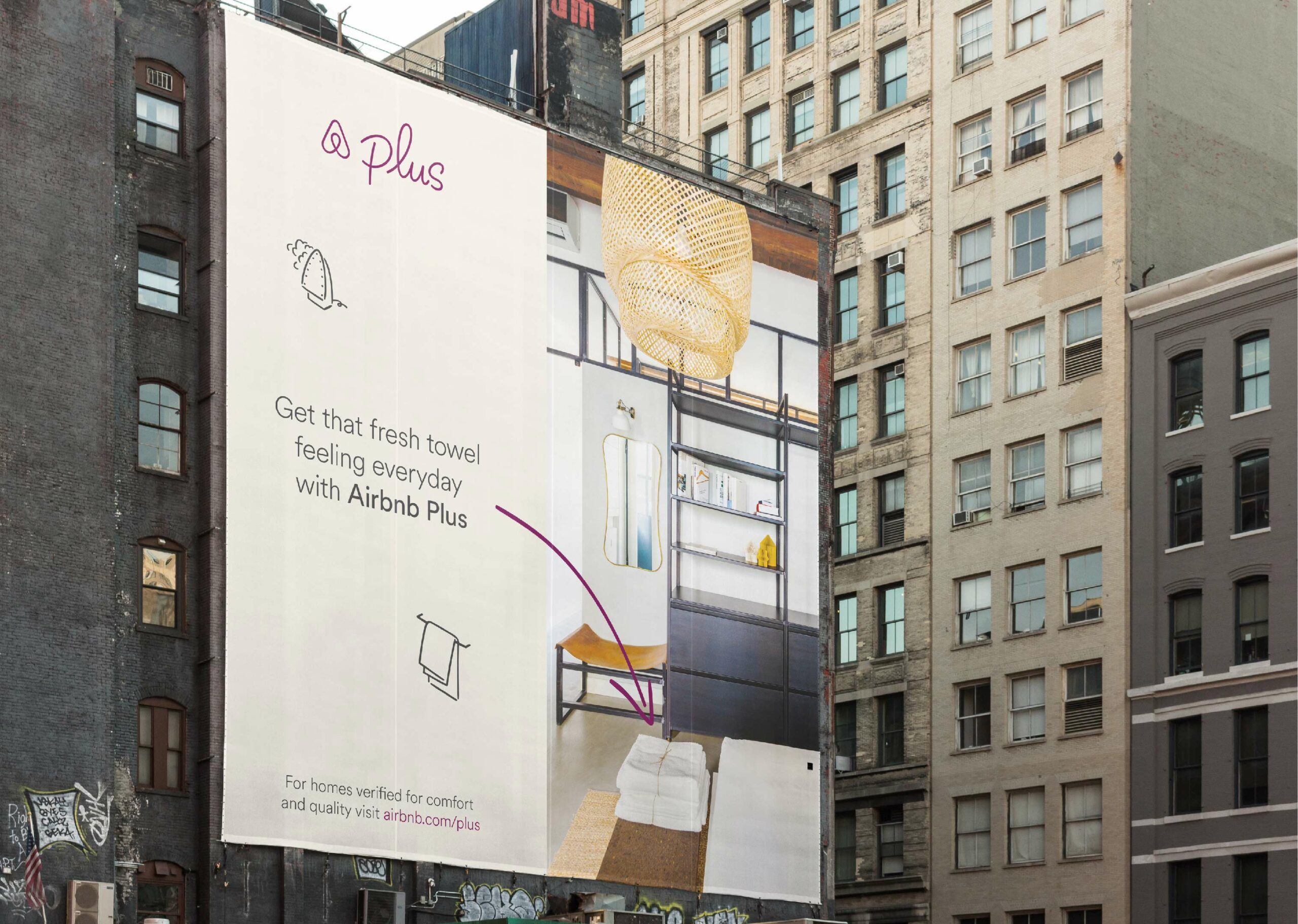
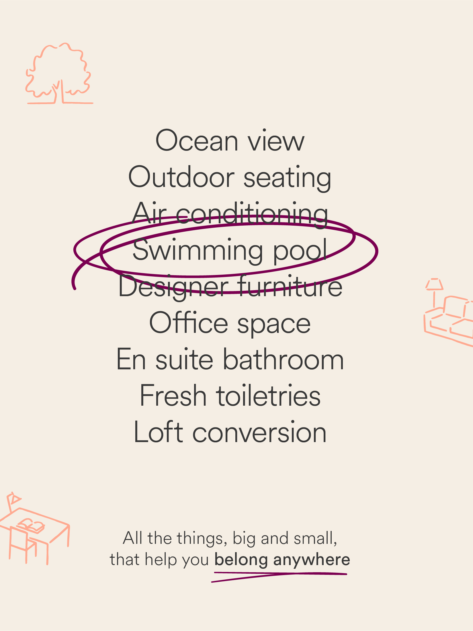
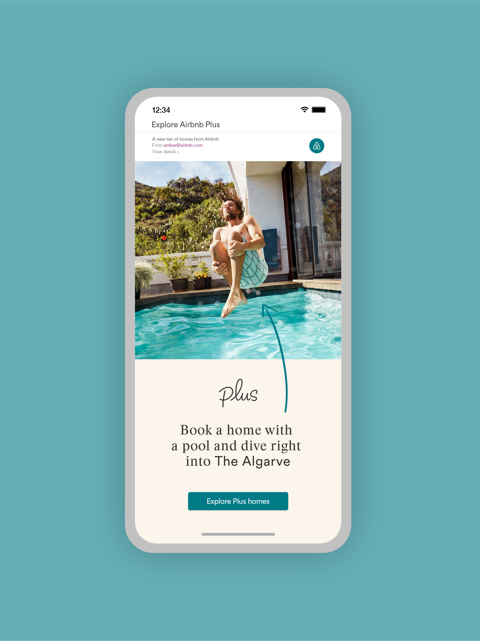
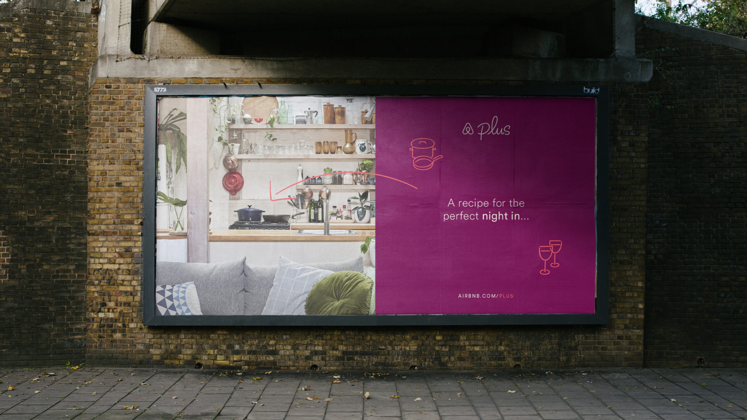
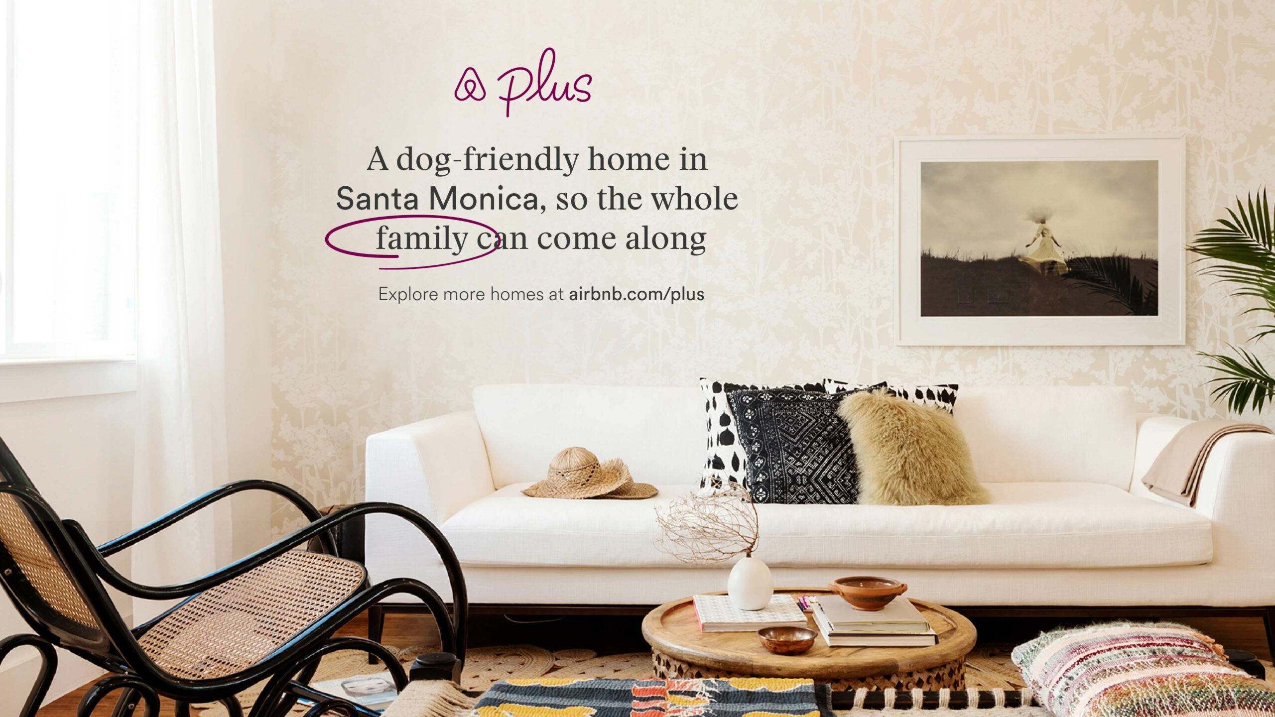
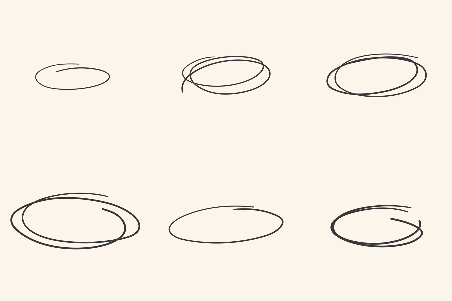
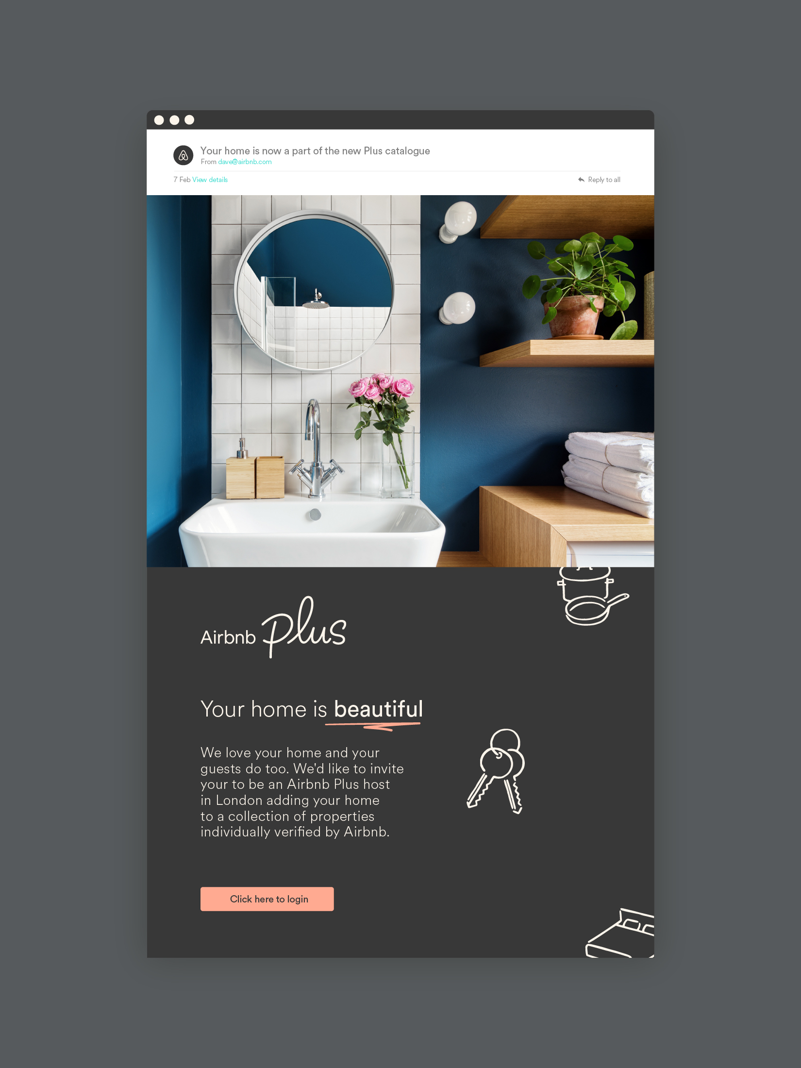
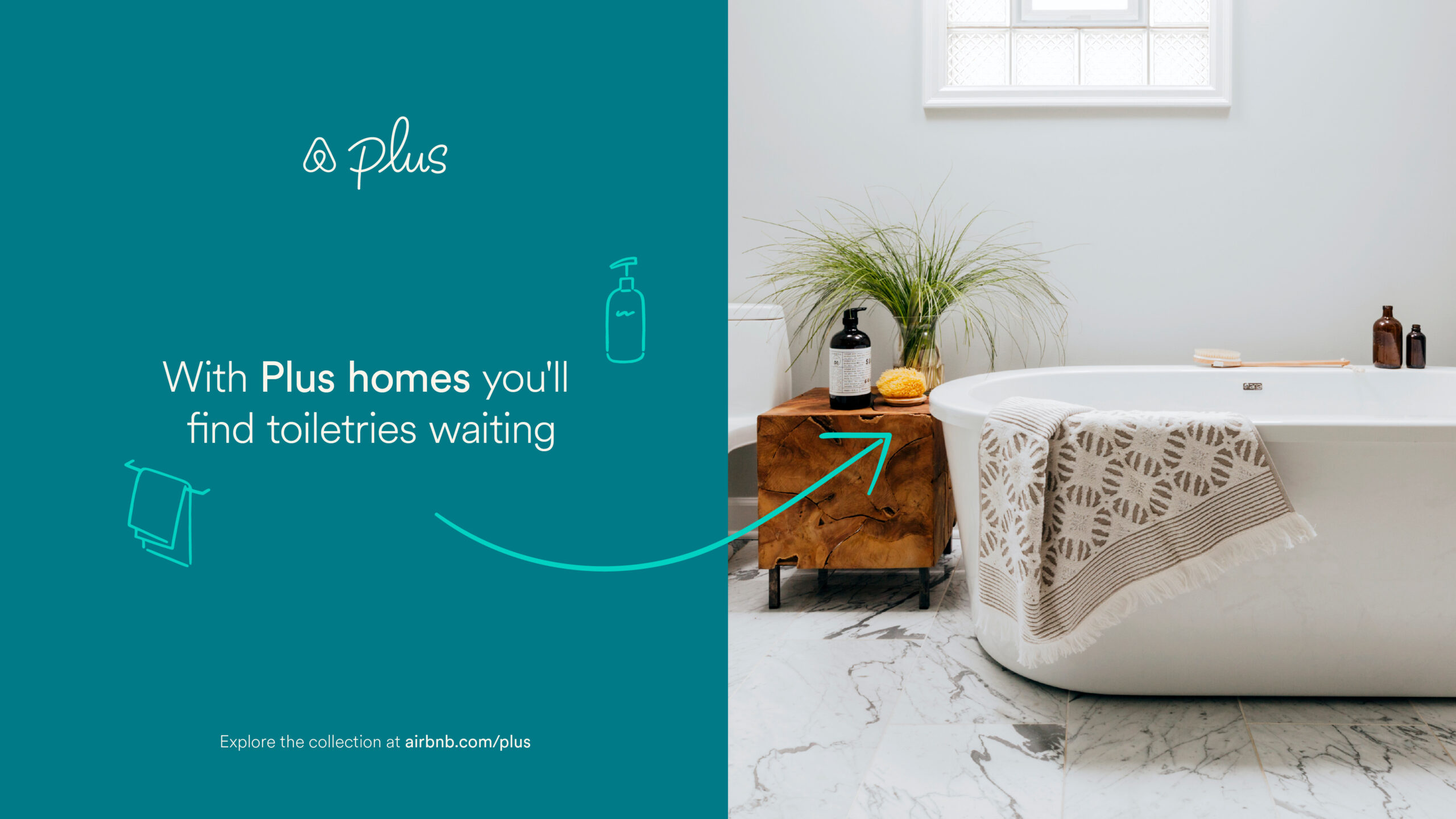
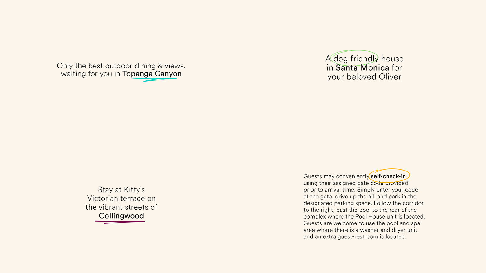
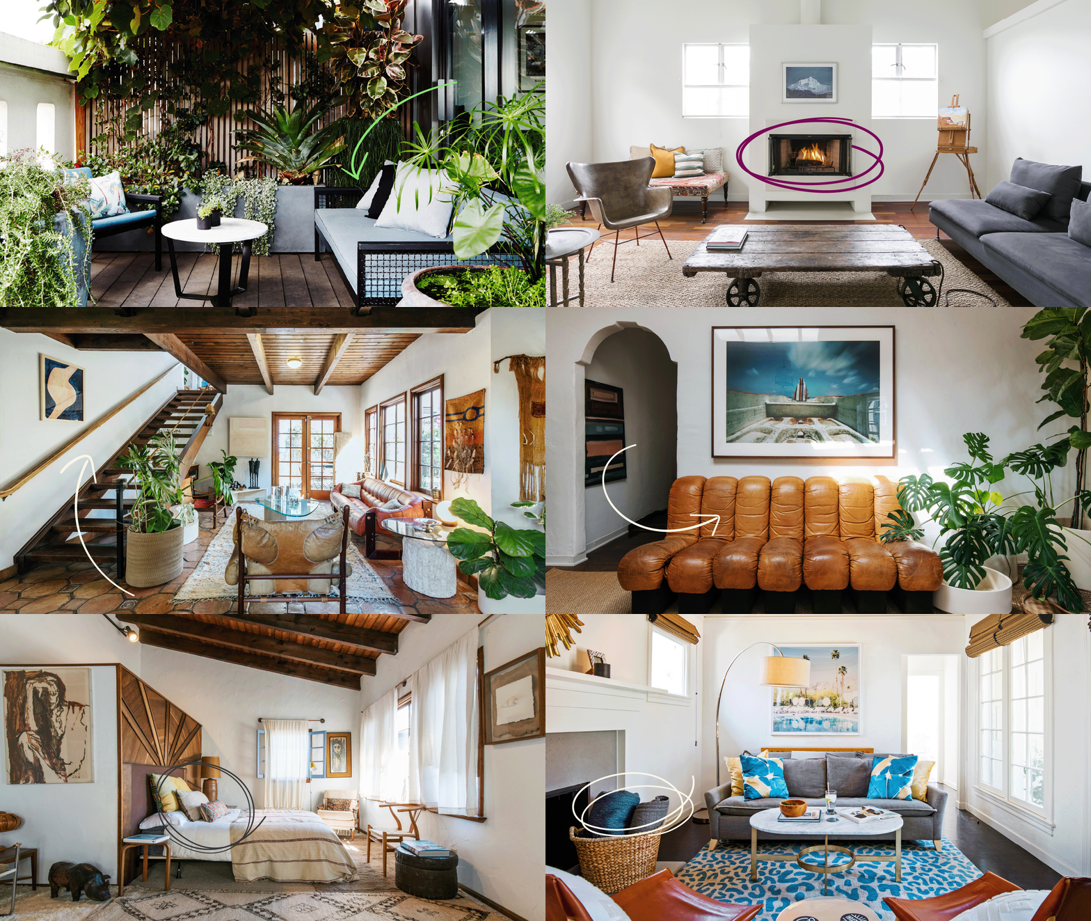
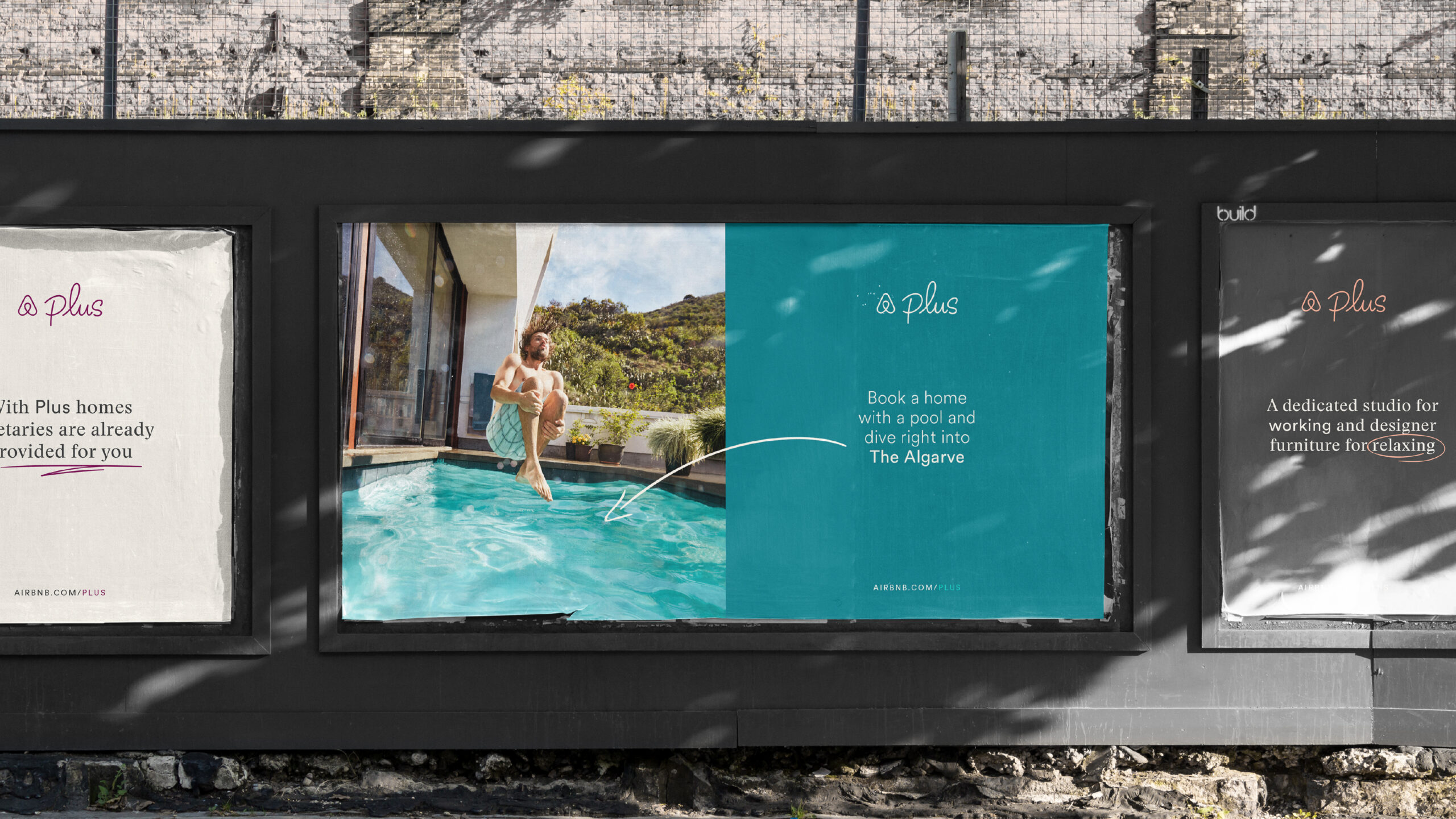
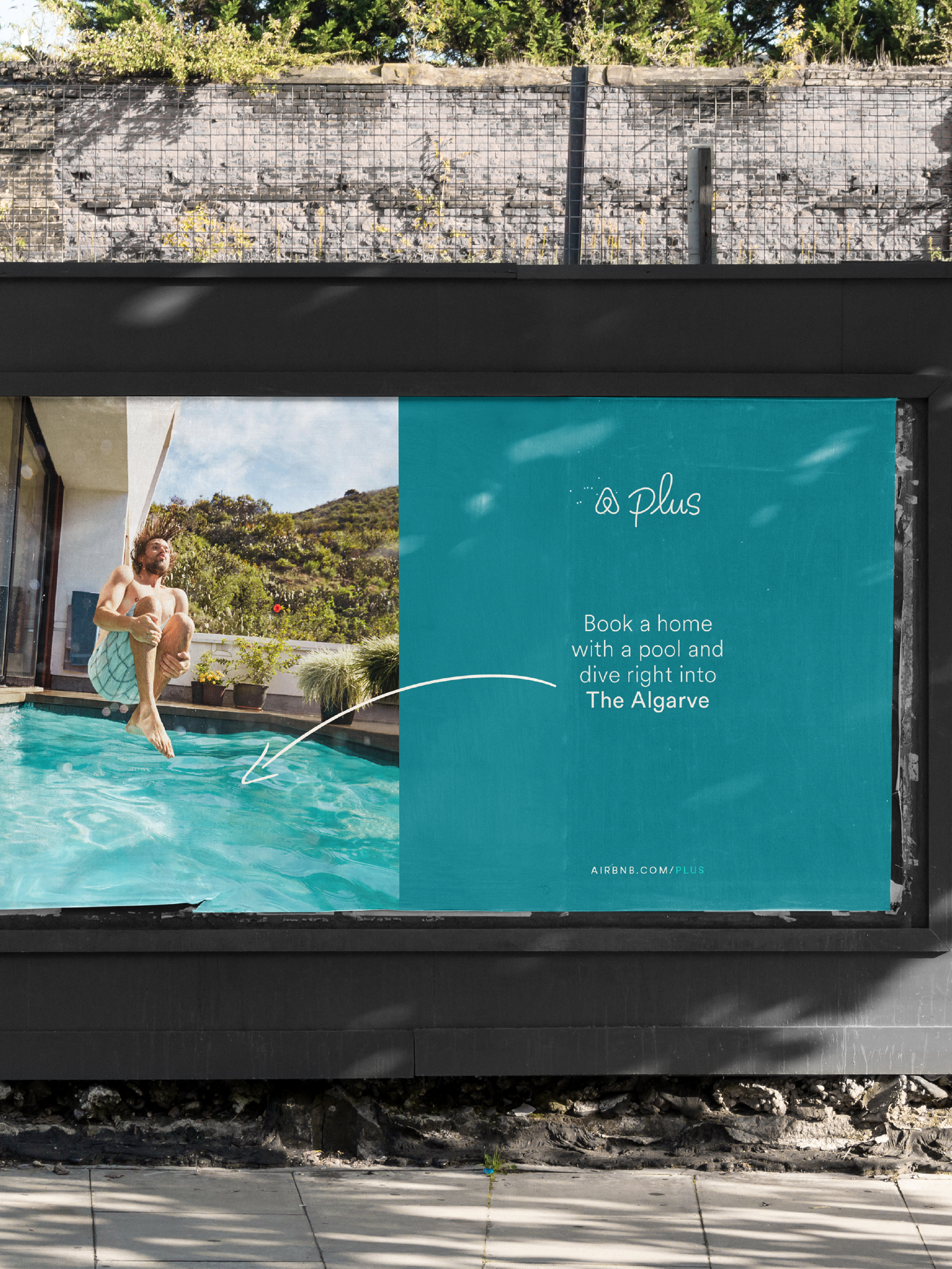
The Airbnb Plus identity reflects the consideration that goes into each of these properties, which have to be verified in person against a 100+ point checklist. Hand-drawn design elements convey the hosts’ personal touches and the human care that goes into each home, while providing Airbnb with a distinctive graphic language for listing curated amenities.
The launch of Airbnb Plus sees a new color – Olin – introduced into the Airbnb palette. It’s a paper-like natural texture that complements the human, handwritten qualities of the overall identity. This has been paired with a focused use of the primary Airbnb color palette, while hand-authored amenities icons by illustrator Yu Nagaba add to the warm welcome.
Big thanks to Amber, Alex, Jospeh and Nina alongside the the whole Airbnb team for being the perfect hosts and collaborators.
SEE MORE
PROJECTS
:)
